Timeless Color Palettes for Kitchens That Never Go Out of Style
How to pick colors that hold up for a decade without looking dated. Whites, earth tones, greens, and blues that age gracefully.
Timeless Color Palettes for Kitchens That Never Go Out of Style
A kitchen gets renovated every fifteen to twenty years on average. That means the color you choose today will share your daily life for more than five thousand days. Trend colors cycle every three or four years. Pick by trend, and ten years from now your kitchen will scream the year it was installed.
This article explores what makes a palette timeless and proposes five combinations proven across decades.
What Makes a Color Timeless
A color ages well when it meets three criteria: it has long-standing presence in design history, it has moderate saturation, and it allows variation without losing identity. The bright turquoise of 2015 fails all three. Warm white, warm gray, and sage green pass all three.
Timeless colors tend to have neutral bases (gray, beige, cream, white, black, earth) or muted versions of primaries (navy, forest green, brick red). They avoid neons, fluorescents, trend pastels, and colors with commercial names ("millennial pink", "greenery").
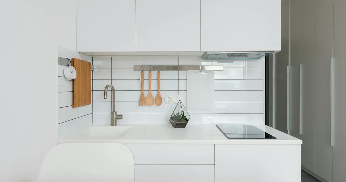
Palette 1: Warm White and Light Wood
The safest duo in the history of the kitchen. Works in modern homes and period homes alike. Pairs with any countertop (marble, granite, quartz, wood). Accepts accessories in any metal finish.
- Fronts: matte warm white (not pure white, which yellows over time)
- Island or accent: light wood like oak or ash
- Countertop: white with veining, or light wood
- Hardware: antique brass or brushed stainless
This scheme has over a century of continuous use in European cabinetry. It will not age.
Palette 2: Sage Green and Cream
Muted green is one of the most stable colors in interior design. Rooted in English and French rural architecture, it has been continuously present since the nineteenth century.
- Base cabinets: sage green (grayish green, not emerald)
- Wall cabinets: cream or warm white
- Countertop: marble with gray veining or light quartz
- Hardware: brushed brass
Warm without looking saturated. Particularly effective in kitchens with abundant natural light.
Palette 3: Navy Blue and White
Deep navy is the kitchen equivalent of navy trousers: never out of season. Works especially well in medium-to-large kitchens where the dark tone doesn't overwhelm.
- Island or base cabinets: navy or petrol blue
- Wall cabinets: warm white
- Countertop: white marble or light quartz
- Backsplash: traditional white subway tile or zellige
- Hardware: aged brass or bronze
Navy has the practical advantage of absorbing marks and smudges better than lighter colors.
Palette 4: Terracotta and Warm Beige
A Mediterranean palette that's resurged without ever fully leaving. Warm, welcoming, and well-suited to homes where the kitchen is a social hub.
- Fronts: warm beige or sand
- Accent: terracotta, tile, or tobacco
- Countertop: beige granite, cream quartz, or wood
- Backsplash: artisanal ceramic or exposed brick
This combination works especially well with warm lighting and solid-wood furniture in the surrounding space.
Palette 5: Warm Gray and Black
For contemporary-design lovers who want sobriety without the risk of extreme minimalism.
- Wall cabinets: matte warm gray
- Base cabinets: matte dark gray or black
- Countertop: gray quartz with subtle veining or black marble
- Hardware: matte black or brushed steel
Warm gray (with a beige base) ages far better than cool gray (with a blue base).
What to Avoid for Longevity
- Colors with "year names" (any commercially branded color of the year)
- High-saturation combinations across multiple large surfaces
- Pure whites (they yellow within ten years)
- Black in glossy finish (shows every fingerprint and speck of dust)
- Bright polished gold hardware (the signature of the 80s — and the early 2020s)
Safety Principle
If you can't decide, follow this rule: neutral on the big things, color on the small things. Neutral fronts, colorful accessories. Accessories change; fronts don't.
A kitchen with white or cream fronts allows reinvention through pots, textiles, lighting, and the soap dispenser. A kitchen with turquoise fronts demands a full redesign to change its mood.
Timeless color isn't boring — it's an investment in future flexibility.